Color Psychology in Interior Design: Crafting Your Mood
Ever walked into a room and instantly felt a shift in your mood? That’s not just a coincidence. It’s the power of color psychology in interior design at play. Understanding how different hues impact our emotions and behaviors is key to creating spaces that not only look good but feel good too. This guide will help you harness that power, transforming your home into a sanctuary that supports your well-being.
Last updated: April 2026.
Table of Contents
- What is Color Psychology in Interior Design?
- How Do Colors Really Impact Our Mood in Design?
- The Energy of Warm Colors: Red, Orange, and Yellow
- The Calm of Cool Colors: Blue, Green, and Purple
- The Balance of Neutrals: White, Black, Gray, and Beige
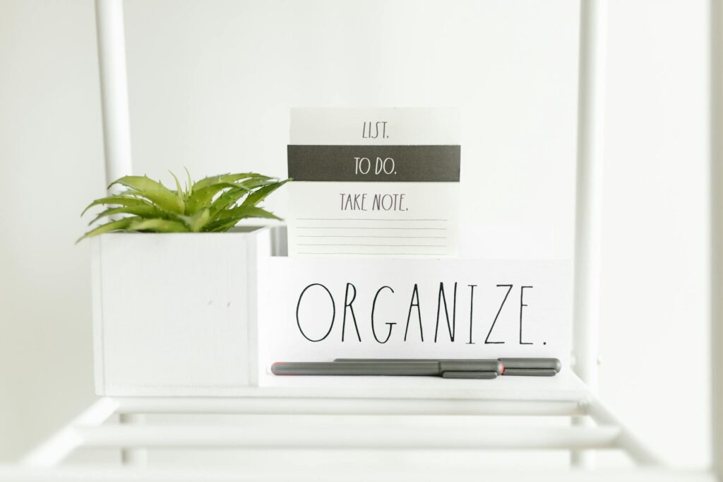
- Practical Application: Applying Color Psychology to Your Space
- Expert Tip: Light and Shadow Play a Role
- Important Note: Personal Associations Matter
- Color Psychology in Interior Design: Pros and Cons
- Frequently Asked Questions
- Conclusion: Design Your Mood with Color
What is Color Psychology in Interior Design?
Color psychology in interior design is the study of how different colors affect human emotions, moods, and behaviors within a built environment. It’s about intentionally selecting and combining colors in your home to evoke specific feelings, enhance functionality, and improve overall well-being. By understanding these psychological associations, you can create spaces that resonate with your desired atmosphere.
For instance, a home office might benefit from colors that promote focus and productivity, while a bedroom could be designed with hues that encourage relaxation and sleep. This isn’t about fleeting trends; it’s about using a fundamental aspect of human perception to make your living spaces more supportive and enjoyable.
How Do Colors Really Impact Our Mood in Design?
Colors influence our mood and perception through a combination of biological and cultural factors. Biologically, certain colors can affect our nervous system, influencing heart rate and brain activity. Culturally, colors are assigned meanings that can vary widely. For example, in Western cultures, white often symbolizes purity and peace, while in some Eastern cultures, it represents mourning. In interior design, we often leverage these common associations to create intentional environments.
When selecting colors, consider the room’s purpose. A high-energy space like a gym might use vibrant reds or oranges, whereas a meditation room might lean towards calming blues or greens. The intensity and shade of a color also play a significant role; a bright, saturated red evokes a different emotion than a muted, dusty rose.
The Energy of Warm Colors: Red, Orange, and Yellow
Warm colors are known for their stimulating and energizing effects. Red, often associated with passion, energy, and excitement, can increase heart rate and create a sense of urgency. In interior design, it’s best used as an accent color in dining rooms or living areas to encourage conversation and warmth. Too much red can be overwhelming, so balance is key.
Orange, a blend of red and yellow, embodies enthusiasm, creativity, and warmth. It’s a welcoming color that can make a space feel more social and inviting, making it ideal for living rooms or entryways. Yellow, symbolizing happiness, optimism, and intellect, can brighten a room and foster a cheerful atmosphere. However, overly bright yellows can sometimes induce anxiety, so opt for softer or muted tones for larger areas.
The Calm of Cool Colors: Blue, Green, and Purple
Cool colors, on the other hand, tend to have a calming and serene effect. Blue is widely associated with tranquility, stability, and peace. It can lower blood pressure and heart rate, making it an excellent choice for bedrooms, bathrooms, or any space where relaxation is paramount. Lighter blues can make a room feel more spacious.
Green, the color of nature, is linked to balance, harmony, and growth. It’s incredibly versatile and can be used in almost any room to create a sense of calm and well-being. Green is known for its restful qualities, making it perfect for studies or living areas. Purple, historically associated with royalty and luxury, can evoke creativity and spirituality. Deeper purples add richness, while lighter lavenders offer a sense of calm and sophistication.
The Balance of Neutrals: White, Black, Gray, and Beige
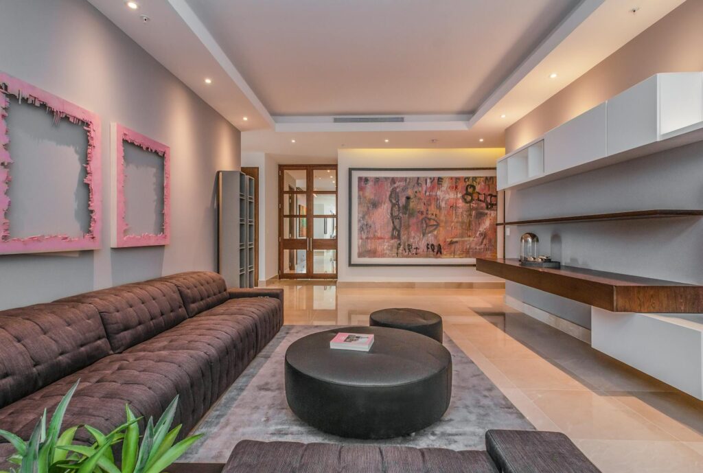
Neutral colors provide a foundation and balance to a color palette. White is often seen as clean, pure, and spacious, but in large doses, it can feel stark. It’s excellent for reflecting light and making spaces feel larger. Black, conversely, adds sophistication, drama, and depth. It’s best used sparingly as an accent to avoid making a space feel heavy or oppressive.
Gray offers a sophisticated and modern feel, acting as a versatile backdrop. It can be warm or cool depending on its undertones. Beige and its variations (like taupe and cream) are warm, comforting, and grounding. They create a cozy and inviting atmosphere, making them ideal for living rooms and bedrooms. Neutrals are excellent for grounding bolder accent colors or for creating a minimalist aesthetic.
Practical Application: Applying Color Psychology to Your Space
Applying color psychology effectively requires considering the room’s function, the desired mood, and the interplay of colors. Start by identifying what you want to feel in each space. For a home office, consider blues or greens for focus, perhaps with a touch of yellow for optimism. For a living room, a balance of warm and cool tones can create a welcoming yet relaxing environment.
Don’t forget the impact of tints, tones, and shades. A pale sky blue will feel very different from a deep navy. Similarly, a soft, buttery yellow creates a different mood than a vibrant lemon yellow. Experiment with paint swatches on your walls, observing them in different lights throughout the day. Consider how the colors will interact with your furniture, décor, and the natural light available.
Important Note: Personal Associations Matter
Color Psychology in Interior Design: Pros and Cons
| Pros | Cons |
|---|---|
| Enhances mood and emotional well-being | Can be subjective; personal associations vary |
| Improves functionality of a space (e.g., focus in office) | Overuse of certain colors can lead to sensory overload or fatigue |
| Creates desired atmosphere and aesthetic | Cultural differences in color meaning can cause misinterpretation |
| Can influence perception of space size and temperature | Trends can shift, making certain color choices feel dated quickly |
| Boosts productivity and creativity | Requires careful consideration of lighting and context |
“Color is a power which directly influences the soul.” – Wassily Kandinsky. Research from the University of Florida in 2020 indicated that exposure to blue light can improve cognitive performance, highlighting the tangible impact of color on our minds.
Frequently Asked Questions
What is the most calming color for a bedroom?
The most calming colors for a bedroom are typically cool tones like soft blues, greens, and lavenders. These hues are associated with tranquility and relaxation, helping to lower stress levels and promote restful sleep. Consider muted shades rather than overly bright ones for maximum serenity.
How can I use color psychology to make a small room feel bigger?
To make a small room feel bigger, use light and cool colors such as whites, pale blues, and soft grays. These colors reflect more light and create an illusion of spaciousness. Applying a lighter color on the ceiling can also draw the eye upward, enhancing the sense of height.
Which colors promote productivity in a home office?
Colors like green and blue are often recommended for home offices as they are linked to focus and clarity. Green promotes balance and calmness, while blue is associated with concentration. Accents of yellow can add a touch of optimism and creativity without being distracting.
Can I mix warm and cool colors in a room?
Yes, you can absolutely mix warm and cool colors. The key is balance. Using neutrals as a base can help to ground a palette that includes both warm and cool tones, creating a harmonious and dynamic space. For example, pair a warm beige wall with cool blue furniture.
What are the psychological effects of red in interior design?
Red is a powerful color associated with energy, passion, and excitement. In interior design, it can stimulate conversation and create a sense of warmth and urgency. However, its intensity can also evoke feelings of anger or aggression if overused. It’s best used as an accent to add vibrancy.
Conclusion: Design Your Mood with Color
Harnessing color psychology in interior design is a powerful way to craft spaces that not only look beautiful but also support your emotional and mental well-being. By understanding the impact of hues like reds, blues, greens, and neutrals, you can intentionally create environments that inspire energy, promote calm, or foster focus. Remember to consider your personal associations and test colors in your specific space. Ready to start transforming your home into a feeling-filled sanctuary? Begin by choosing one room and experimenting with a color palette that speaks to you.