Line: The Foundation of Visual Structure
This guide covers everything about elements of art and design explained. Line is the most basic element, a mark connecting two points. It can be straight, curved, thick, thin, broken, or continuous. Lines define shapes, create edges, suggest movement, and establish direction within a piece.
Last updated: May 2, 2026
For instance, a series of parallel, thin lines might suggest distance or movement, while bold, jagged lines can convey energy or aggression. In graphic design, a strong vertical line can create a sense of stability, whereas a diagonal line introduces dynamism. According to graphic design textbooks, line is often the first element considered when sketching out ideas.
Shape and Form: Defining Space
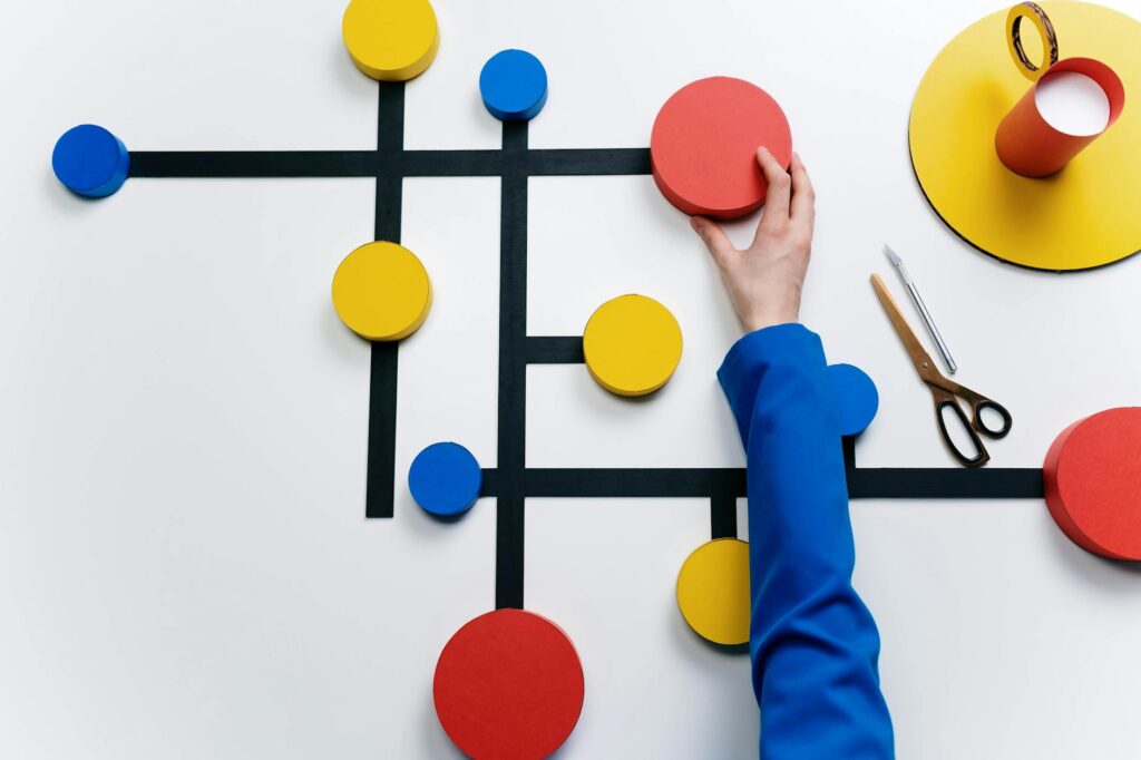
Shape refers to a two-dimensional area with a defined boundary, like a circle, square, or triangle. Form, conversely, describes three-dimensional objects that have volume and mass, such as a sphere, cube, or pyramid. Both are critical for creating recognizable objects and structures.
A graphic designer might use a clean, geometric shape to represent technology, while a sculptor will manipulate form to create a lifelike human figure. The interplay between positive (the object itself) and negative (the space around it) shapes and forms is crucial for balance and visual hierarchy. For example, the shape of a logo often communicates the brand’s essence.
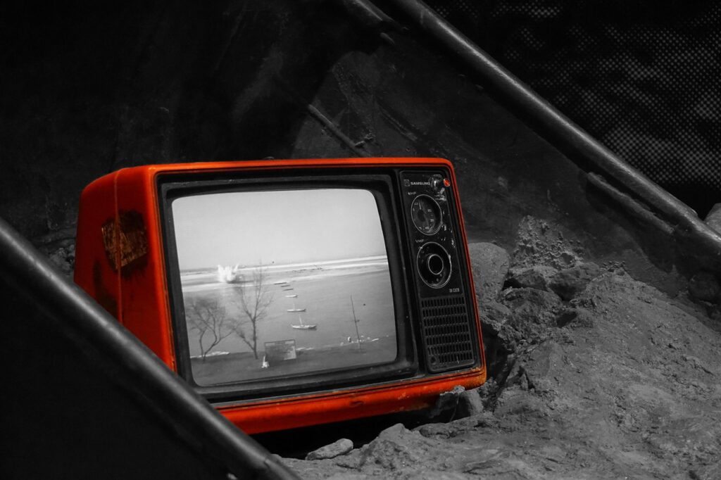
Color: Evoking Emotion and Meaning
Color is arguably the most powerful element, capable of eliciting strong emotional responses and conveying complex ideas. It encompasses hue (the name of the color, like red), saturation (intensity), and value (lightness or darkness). Color theory, a well-established field of study, explains how colors interact and affect us.
Warm colors like red and orange tend to be energetic and inviting, while cool colors such as blue and green are often calming. A designer might use contrasting colors to draw attention to a specific call-to-action button, or a painter might use a monochromatic scheme to create a sense of harmony. The Psychology of Color research consistently shows its impact on consumer behavior.
Value: The Play of Light and Shadow
Value refers to the lightness or darkness of a color or tone. It’s essential for creating depth, contrast, and a sense of three-dimensionality. Value differences are what allow us to perceive form and separate objects from their backgrounds.
A photograph relies heavily on value to render its subjects realistically. In drawing and painting, skilled artists use a wide range of values to create dramatic lighting effects or subtle shading. Even in minimalist design, strategic use of light and dark values can guide the viewer’s eye and create visual interest. The National Gallery of Art often highlights value studies in its educational materials.
Texture: The Sense of Touch and Surface
Texture refers to the perceived surface quality of an object. It can be actual (how something feels to the touch, like the rough bark of a tree) or implied (how it looks like it would feel, like the smooth sheen of silk in a painting). Texture adds sensory depth and realism.
A textile designer will focus intensely on creating appealing tactile textures. A digital artist might use brush strokes or photographic elements to simulate rough paper or smooth glass. The tactile quality of a website’s design, often conveyed through visual cues, can significantly influence user experience. For instance, a button that looks slightly raised (implied texture) might appear more clickable.
Space: The Illusion of Depth and Volume
Space refers to the area within, around, between, or above objects. It can be two-dimensional (like the flat surface of a canvas) or three-dimensional (like the volume of a room). Artists use techniques like perspective, overlapping, and foreshortening to create the illusion of depth and space on a flat surface.
In interior design, the arrangement of furniture and the use of empty space (negative space) are critical for creating a comfortable and functional environment. Graphic designers use space to organize information, prevent clutter, and ensure readability. White space, often overlooked, is a powerful tool for creating emphasis and directing attention. According to studies on visual perception, ample white space can increase engagement by up to 20%.
Principles of Design: Orchestrating the Elements
While the elements are the components, the principles of design are the guidelines for how those elements are arranged. These include balance, contrast, emphasis, movement, pattern, rhythm, and unity. They are the rules that govern how the elements work together effectively. Understanding the principles is key to moving from simply using elements to creating coherent and compelling art and design.
For example, balance can be achieved symmetrically (mirrored) or asymmetrically (unevenly distributed elements creating a sense of equilibrium). Emphasis uses contrast or placement to draw the viewer’s eye to a focal point. A well-designed poster will use these principles to guide your reading experience. As of 2026, these principles continue to form the basis of design education globally.
Practical Application: Bringing Elements to Life
The true power of understanding the elements of art and design lies in their practical application. It’s not just about defining them; it’s about using them intentionally to achieve specific goals.
Example: Designing a Book Cover
Imagine designing a book cover for a historical thriller. You might use:
- Line: Sharp, angular lines to suggest danger and tension.
- Shape/Form: A central, dominant shape, perhaps a silhouette of a character or a key object, to create emphasis.
- Color: A dark, desaturated palette (deep blues, greys, blacks) with a single bright accent color (like a splash of red) to signify a crucial plot element or hint at violence.
- Value: High contrast between light and dark areas to create mood and drama.
- Texture: Implied texture of rough paper or weathered stone to convey age and grit.
- Space: Strategic use of negative space to make the central figure feel isolated or ominous.
These choices, guided by the principles of design (like emphasis on the main subject and a balanced yet tense composition), work together to communicate the genre and mood of the book before a single word is read.
Common Mistakes and How to Avoid Them
Many creators, especially beginners, stumble over common pitfalls when working with the elements of art and design.
Mistake 1: Overlooking Negative Space
Problem: Filling every inch of the canvas or screen, leading to a cluttered and overwhelming design. This can make it hard for the viewer to focus on key elements. A cluttered website, for example, is less likely to retain visitors.
Solution: Consciously incorporate white space (or negative space). Step back from your work and ask if there’s too much information competing for attention. Sometimes, removing elements can make the remaining ones stronger.
Mistake 2: Inconsistent Use of Color or Value
Problem: Using a chaotic color palette or inconsistent lighting that confuses the viewer. This might happen when trying too many colors or relying on arbitrary shading.
Solution: Develop a color scheme and a clear understanding of your light source. Use color palettes with complementary colors for contrast or analogous colors for harmony. For value, establish a consistent light direction to define forms realistically.
Mistake 3: Neglecting Texture
Problem: Creating flat, uninteresting surfaces that lack depth and tactile appeal. This can make a piece feel generic or uninspired.
Solution: Look for opportunities to add textural interest, whether through actual materials (in sculpture or mixed media) or implied textures (in digital art or painting). Observe real-world textures closely—how light hits them, their inherent patterns.
Expert Tips for Mastering the Elements
Beyond the basics, there are nuanced ways to elevate your use of art and design elements.
Tip 1: Study Master Artists and Designers
Analyze the work of artists whose compositions you admire. How do they use line to create movement? What color palettes do they favor, and why? For example, the bold use of color and distinct lines in the work of contemporary African artists like El Anatsui or Njideka Akunyili Crosby often tell complex stories about identity and history.
Tip 2: Practice Active Observation
Become a keen observer of the world around you. Notice the textures of everyday objects, the way light falls on buildings, the shapes of clouds. This constant visual intake fuels your creative reservoir.
Tip 3: Embrace Constraints
Sometimes, limitations breed creativity. Try working with a restricted color palette, a single type of line, or a specific set of shapes. This forces you to think more deeply about how to use each element effectively.
Tip 4: Seek and Incorporate Feedback
Share your work with trusted peers or mentors and ask specific questions about how the elements are working. Does the composition feel balanced? Is the focal point clear? Constructive criticism is invaluable for growth.
Frequently Asked Questions
What are the 7 basic elements of art?
The seven basic elements of art and design are line, shape, form, color, value, texture, and space. These are the fundamental components used to create any visual artwork or design piece, forming the visual vocabulary for creators.
How do elements of art differ from principles of design?
Elements are the basic visual components (like line, color, shape), while principles are the guidelines for arranging these elements (like balance, contrast, emphasis). Think of elements as the ingredients and principles as the recipe for a successful composition.
Can I use only a few elements and still create good art?
Yes, you can create impactful art by mastering just a few elements, but a complete understanding allows for greater flexibility and richer expression. Often, a strong piece might emphasize one or two elements while subtly incorporating others.
How does value contribute to a design’s effectiveness?
Value, the lightness or darkness of an area, creates contrast, depth, and form. It helps define shapes, separate elements, and guide the viewer’s eye, significantly impacting the mood and readability of a design.
Is texture only about how something feels?
Texture in art and design can be actual (tactile) or implied (visual). Implied texture relies on visual cues to suggest surface quality, allowing flat images to convey roughness, smoothness, or other tactile sensations.
How does space influence visual perception?
Space creates the illusion of depth and volume, or the feeling of emptiness and proximity. Proper use of positive and negative space organizes elements, directs attention, and can significantly impact the emotional and aesthetic experience of a piece.
By thoroughly understanding and intentionally applying these core components, creators can move beyond mere decoration to craft visuals that are not only aesthetically pleasing but also deeply communicative and resonant. As you continue your creative journey in 2026 and beyond, let these elements be your guide to building stronger, more impactful art and designs.
Source: Britannica
Editorial Note: This article was researched and written by the Afro Literary Magazine editorial team. We fact-check our content and update it regularly. For questions or corrections, contact us.
Related read: Art as Social Commentary: Visualizing Today's Pressing Issues in 2026. Knowing how to address elements of art and design explained early makes the rest of your plan easier to keep on track.