This guide covers everything about elements of visual design. Think of these elements as the alphabet of visual language. You can’t write a novel without letters, and you can’t create impactful design without mastering these foundational components. Whether you’re a seasoned graphic designer, a budding web developer, or simply someone looking to enhance your visual communication skills, grasping these principles is essential for success in the creative world of 2026.
Last updated: May 2, 2026
Line: The Foundation of Form and Direction
Lines are one of the most basic yet powerful elements. They can be straight, curved, thick, thin, jagged, or smooth. Lines define shapes, create boundaries, suggest movement, and evoke emotion. A sharp, angular line might convey energy or tension, while a soft, flowing line can suggest grace or calmness.
Practical Insight: When using lines, consider their direction. Horizontal lines often suggest stability and rest, vertical lines imply strength and formality, and diagonal lines create dynamism and excitement. The weight and style of your lines will significantly influence the overall mood of your design.
Shape and Form: Defining Space and Dimension
Shapes are two-dimensional areas defined by lines or color. They can be geometric (circles, squares, triangles) or organic (free-flowing, natural shapes). Forms, on the other hand, are three-dimensional and have volume and depth. While most graphic design is two-dimensional, the illusion of form can be created through shading and perspective.
Use Case: Geometric shapes are often used in branding for their stability and clarity, like the iconic circles in the Audi logo. Organic shapes can add a softer, more approachable feel, seen in many nature-inspired logos. Understanding how shapes interact is key to creating balanced layouts.
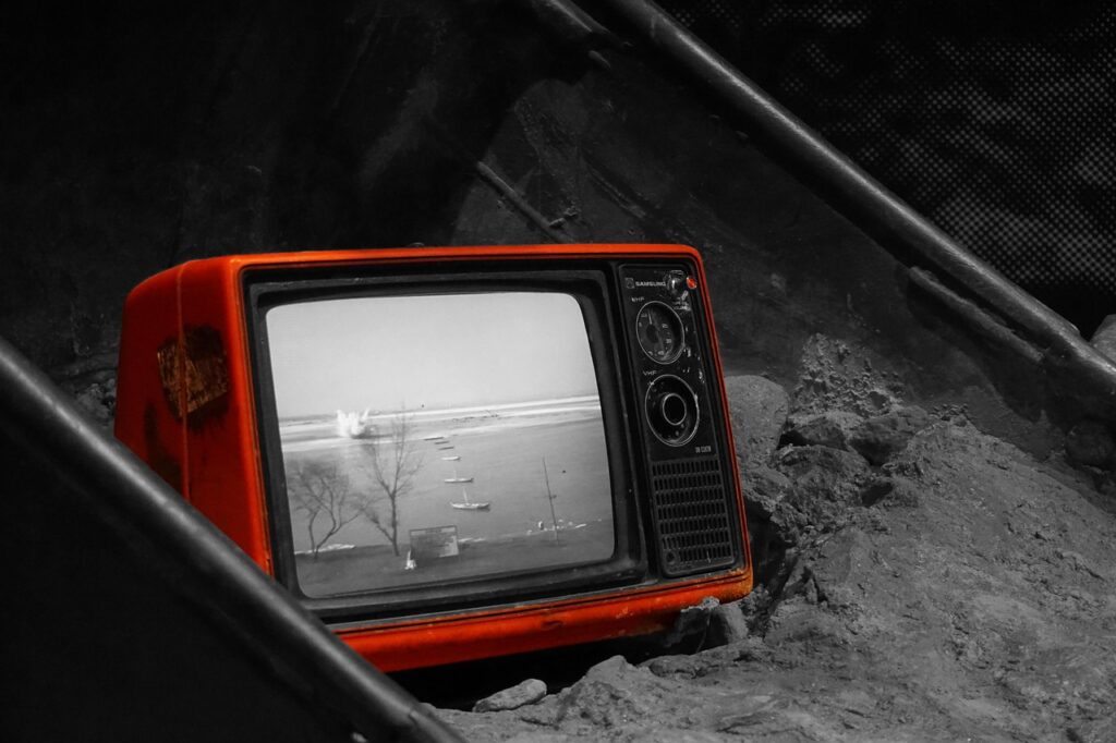
Color: Evoking Emotion and Guiding Perception
Color is arguably the most impactful element, capable of evoking strong emotions, setting a mood, and even conveying meaning. Color theory delves into how colors interact, their psychological effects, and how to create harmonious palettes. This includes understanding hues, saturation, and value (brightness).
According to Adobe’s 2025 Creative Trends report, specific color palettes are gaining traction in digital design, with a focus on gradients that blend earthy tones with vibrant pops of electric blue or coral, aiming for both calm and energetic user experiences. This shows how color choice is directly tied to user perception and emotional response.
Practical Insight: Consider the cultural associations of colors. For example, white signifies purity in Western cultures but mourning in some Eastern cultures. Always research your target audience’s perception of colors to avoid unintended messages.
Texture: Adding Depth and Tactile Quality
Texture refers to the surface quality of an object, how it feels or appears to feel. In visual design, texture can be literal (e.g., using a wood grain background) or implied through patterns, shading, and contrast. It adds depth, interest, and a sense of realism to a design.
Use Case: A website aiming for a luxurious feel might use subtle, glossy textures on buttons or background elements. Conversely, a design for an eco-friendly brand might incorporate rough, natural textures like paper or wood grain. Even digital textures require careful consideration of how they render on different screens.
Space: The Unseen Element of Balance
Space, also known as negative space or white space, is the area around, between, and within elements of a design. It’s not just empty background; it’s a crucial element that gives other elements room to breathe, enhances readability, and guides the viewer’s eye. Effective use of space can make a design feel clean, sophisticated, and less cluttered.
The principle of visual hierarchy often relies heavily on space. For instance, ample white space around a call-to-action button naturally draws the user’s attention to it. Conversely, a lack of space can make a design feel overwhelming and difficult to navigate.
Practical Insight: Don’t be afraid of empty space. It’s a powerful tool for emphasizing content, improving clarity, and creating a sense of elegance. Think of it as the silence between musical notes – essential for the melody.
Typography: The Voice of Your Design
Typography is the art and technique of arranging type to make written language legible, readable, and appealing when displayed. The choice of font, its size, spacing (kerning and leading), and arrangement all contribute significantly to the overall message and tone of a design. As of 2026, variable fonts and AI-assisted typographic design are increasingly common, offering greater flexibility and efficiency.
Use Case: A formal report might use a serif font like Times New Roman for its classic, authoritative feel, while a playful children’s book would benefit from a more whimsical, rounded sans-serif font. The readability of typography across different devices is a constant consideration.
Practical Insight: Aim for contrast in your typography. Pairing a bold sans-serif headline with a more subdued serif body text can create visual interest and improve readability. Ensure sufficient line height (leading) to prevent text from feeling cramped.
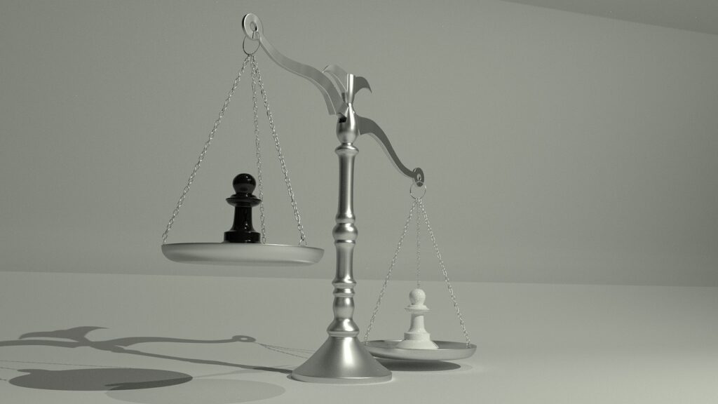
Balance: Achieving Harmony and Stability
Balance refers to the distribution of visual weight in a design. It can be symmetrical, where elements are mirrored on either side of a central axis, creating a sense of order and formality. Or it can be asymmetrical, where elements of differing weights are arranged to create a dynamic yet stable composition. Radial balance, where elements radiate from a central point, is another common approach.
Example: A perfectly symmetrical website header with a centered logo and equal spacing on either side provides a sense of stability. An asymmetrical layout might feature a large image on one side balanced by a block of text and smaller graphical elements on the other, creating a more engaging, less rigid feel.
Contrast: Creating Emphasis and Visual Interest
Contrast occurs when two or more elements are different from each other. This can be through color (light vs. Dark), size (big vs. Small), shape (round vs. Square), or texture (smooth vs. Rough). Contrast is vital for creating visual interest, guiding the viewer’s eye, and highlighting important information.
According to numerous design studies, including those published by the Nielsen Norman Group, effective contrast is paramount for accessibility, ensuring that text is legible for users with visual impairments. For example, ensuring sufficient contrast between text and its background is a WCAG (Web Content Accessibility Guidelines) requirement.
Practical Insight: Use contrast intentionally. High contrast can create a dramatic effect, while subtle contrast can add nuance. Be mindful of accessibility standards when choosing color combinations for text and backgrounds.
Hierarchy: Guiding the Viewer’s Journey
Visual hierarchy is the arrangement and presentation of elements in a way that implies importance. It directs the viewer’s eye through the design, ensuring they see the most critical information first. This is achieved through variations in size, color, placement, and contrast.
Use Case: On a product landing page, the product image might be the largest element, followed by the headline, then a brief description, and finally the ‘Add to Cart’ button. This arrangement guides the user through the purchasing decision process naturally.
Unity and Harmony: Bringing It All Together
Unity and harmony are achieved when all the individual elements of a design work together cohesively to create a sense of completeness and belonging. This doesn’t mean everything has to be the same; rather, it’s about creating a relationship between elements that feels balanced and aesthetically pleasing. Repetition of elements, consistent color palettes, and aligned spacing contribute to unity.
Practical Insight: A consistent visual style guide is crucial for maintaining unity across a brand’s various platforms and materials. This ensures that all communications feel like they come from the same source, reinforcing brand identity.
Common Mistakes in Applying Visual Design Elements
One common pitfall is overcrowding a design, leading to a lack of negative space and overwhelming the viewer. Another mistake is poor color contrast, which not only makes a design look amateurish but also poses accessibility issues. Inconsistent typography across a project also breaks unity and confuses the audience.
Solution: Step back and evaluate your design with fresh eyes. Ask yourself: What is the most important message? Is it immediately clear? If not, adjust your hierarchy and spacing. Always test your design for readability and accessibility on multiple devices and for users with different needs.
Expert Tips for 2026 and Beyond
As of May 2026, the digital design landscape continues to evolve with AI-powered tools. Embrace these tools for efficiency, but never let them replace your fundamental understanding of design principles. For instance, use AI to generate color palette suggestions, but apply your knowledge of color psychology to make the final selection.
Focus on user experience (UX). The most beautiful design is useless if it’s not functional. Ensure that your application of visual design elements supports usability and intuitive navigation. For websites and apps, prioritize mobile-first design, as mobile traffic continues to dominate global internet usage according to data from Statista.
Unique Insight: Consider the narrative. Every design tells a story. By thoughtfully arranging the elements of visual design, you can craft a compelling narrative that resonates with your audience on an emotional and intellectual level, going beyond mere aesthetics to create genuine connection.
Frequently Asked Questions
What are the seven basic elements of visual design?
The seven fundamental elements of visual design are generally considered to be line, shape, form, color, texture, space, and typography. These are the core components that designers use to create any visual composition.
How do elements of visual design differ from principles of design?
Elements are the basic building blocks (like line, color, shape), while principles are the guidelines for how to use those elements effectively (like balance, contrast, hierarchy, unity). Think of elements as ingredients and principles as the recipe.
Why is visual hierarchy important in design?
Visual hierarchy is crucial because it guides the viewer’s eye through a design, ensuring they process information in the intended order of importance. It makes complex information digestible and improves user experience.
Can I use too much white space in a design?
While white space is essential, it’s possible to use it excessively, which can make a design feel empty or disconnected. The key is to find a balance that enhances readability and focus without making content feel sparse.
How does color impact visual design in 2026?
Color continues to be a primary driver of emotion and perception in 2026. Current trends show a blend of calming earth tones with energetic accents, emphasizing thoughtful psychological impact and accessibility in digital interfaces.
Conclusion
Mastering the elements of visual design is an ongoing journey, not a destination. By understanding and intentionally applying principles like line, shape, color, texture, space, and typography, you can elevate your creative work from ordinary to extraordinary. Remember that effective design is a conversation between the creator and the viewer, and these elements are your vocabulary.
Source: Britannica
Related Articles
- Algebraic Variables X and Y in Equations: A 2026 Guide
- Elizabeth Upshur: What's New and What's Next
- Sandy Mahl: Understanding Her Unique Artistic Voice
Editorial Note: This article was researched and written by the Afro Literary Magazine editorial team. We fact-check our content and update it regularly. For questions or corrections, contact us. Knowing how to address elements of visual design early makes the rest of your plan easier to keep on track.