Line: The First Stroke of Expression
This guide covers everything about elements of art and design. Line is perhaps the most fundamental element, defining edges, contours, and directions. It can be thick or thin, solid or dashed, straight or curved, conveying movement, emotion, and structure. A thin, delicate line might suggest fragility, while a bold, jagged line can imply energy or aggression.
Last updated: May 1, 2026
In graphic design, the clean, sharp lines of a minimalist poster create a sense of order and sophistication. Conversely, the expressive, varied line work in a charcoal sketch conveys raw emotion and tactile quality.
Shape and Form: Defining the Two- and Three-Dimensional
Shape refers to a two-dimensional area defined by lines or color, like a circle or a square. Form, on the other hand, describes a three-dimensional object with volume and depth, such as a sphere or a cube. Both are crucial for creating recognizable objects and establishing visual interest.
Architecture relies heavily on geometric shapes and forms to create functional and aesthetically pleasing structures. Organic shapes, like those found in nature, can bring a softer, more natural feel to a design.
Color: The Language of Emotion and Meaning
Color is a powerful element, capable of evoking strong emotional responses and conveying symbolic meaning. It encompasses hue (the color itself), saturation (intensity), and value (lightness or darkness). Understanding color theory is key to effective visual communication.
The use of warm colors like red and orange can create a sense of excitement and urgency, often seen in advertisements for fast food or sales events. Cool colors like blue and green tend to evoke feelings of calm and stability, common in branding for financial institutions or wellness products.
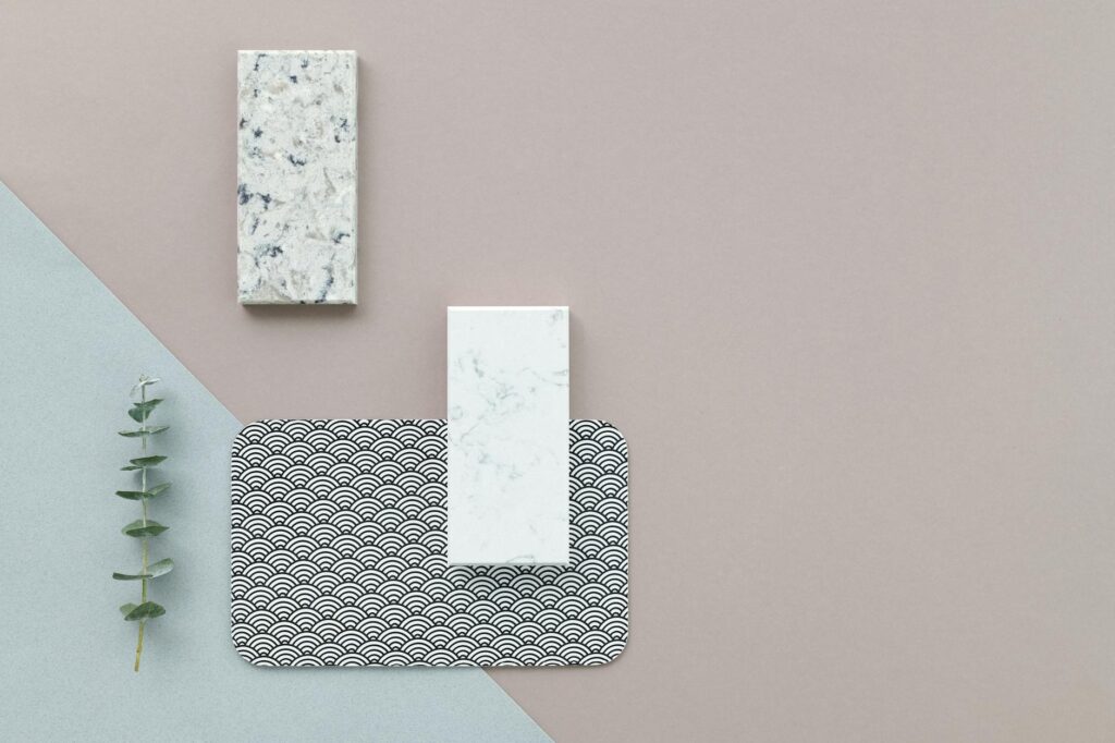
Texture: The Tactile and Visual Sensation
Texture refers to the perceived surface quality of an object, whether it’s smooth, rough, bumpy, or soft. It can be actual (physical texture) or implied (visual texture). Texture adds depth, realism, and sensory appeal to a design.
A photographer might use close-up shots to highlight the rough texture of tree bark or the smooth sheen of polished metal, adding a tactile dimension to the visual. In print design, embossed lettering creates literal texture.
Space and Balance: Creating Harmony and Flow
Space refers to the areas around, between, and within elements. It can be positive (occupied by elements) or negative (empty). Balance is achieved when the visual weight of elements is distributed evenly, creating stability.
Japanese gardens often masterfully use negative space to create a sense of tranquility and focus. Symmetrical balance in a formal portrait conveys stability and seriousness, while asymmetrical balance in a modern website layout can feel more dynamic and engaging.
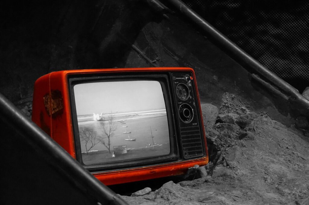
Value: The Play of Light and Shadow
Value refers to the lightness or darkness of a color or tone. It’s crucial for creating contrast, depth, and mood. High contrast (a wide range of values) creates drama, while low contrast can feel subtle or serene.
Film noir is famous for its dramatic use of value, employing stark contrasts between light and shadow to create suspense and atmosphere. A black and white photograph relies entirely on value to convey its subject matter.
Putting Elements to Work: Practical Application
Understanding these elements is only the first step. The true skill lies in how they are combined and manipulated using the principles of design (like contrast, hierarchy, repetition, proximity, alignment, and unity) to achieve a desired outcome.
Example Scenario: Imagine designing a flyer for a local music festival. You’d use bold, energetic lines and vibrant, contrasting colors (elements) to attract attention. You’d arrange band names in varying font sizes (hierarchy) and group information logically (proximity and alignment) to ensure readability. The overall composition needs to feel unified and exciting, reflecting the festival’s spirit.
Common Pitfalls to Avoid
Many creators stumble by overlooking the foundational elements or misapplying them. One common mistake is ignoring negative space, leading to designs that feel cramped and overwhelming. Another is poor color choices that clash or fail to create the intended mood.
Mistake: Over-reliance on Too Many Elements. Trying to cram every possible element and principle into one design often results in chaos. The result is a loss of focus and clarity, confusing the viewer.
Solution: Prioritize and Simplify. Identify the most important message or feeling you want to convey and select the elements that best serve that purpose. Less can often be more. As of 2026, minimalist design principles continue to be highly valued for their clarity.
Mistake: Lack of Contrast. Designs with insufficient contrast in value, color, or size can be difficult to read and visually uninteresting. This is particularly problematic for accessibility.
Solution: Deliberate Contrast. Intentionally create contrast where it matters most—between key elements and their surroundings, or between foreground and background. This guides the viewer’s eye and improves legibility. According to the Web Content Accessibility Guidelines (WCAG) 2.2, sufficient contrast is a requirement for web usability.
Expert Insights for Elevating Your Designs
Beyond the basic definitions, true mastery involves a nuanced understanding. For instance, the interplay between implied texture and actual texture can create surprisingly rich visual experiences in digital media. Think of how a website might use rough-edged graphics (implied texture) alongside actual physical buttons on a device (actual texture).
Unique Insight: The ‘Emotional Weight’ of Elements. Different elements carry different emotional weights. A heavy, dark form might feel grounded and serious, while a light, airy composition can feel optimistic and free. Understanding this allows you to intentionally shape the viewer’s emotional response. This concept is often explored in art therapy, highlighting the psychological impact of visual elements.
Tip: Study the Masters. Analyze the work of artists and designers you admire. Deconstruct their pieces: How did they use line? What was their color palette? What kind of space did they create? Websites like the Tate Modern offer extensive online collections for study.
Tip: Practice Active Observation. Look at the world around you through the lens of design elements. Notice the lines of buildings, the shapes of clouds, the textures of fabrics. This constant practice hones your visual literacy. Diameter: How Size Shapes Our World in 2026
Frequently Asked Questions
What are the basic elements of art and design?
The fundamental elements typically include line, shape, form, color, texture, space, and value. These are the building blocks that artists and designers use to create visual compositions and communicate ideas.
How do the elements of art and design differ from principles of design?
Elements are the ingredients or components of a design, while principles are the rules or guidelines for how those elements are arranged and interact to create effective compositions.
Can elements of art and design be used in any creative field?
Absolutely. Whether you’re a painter, graphic designer, architect, writer, or even a chef, understanding and applying these visual elements can enhance your ability to communicate and create impactful work.
How important is color value in design?
Color value (lightness or darkness) is crucial for establishing contrast, depth, and mood. It helps define form, separate elements, and create visual hierarchy, significantly impacting a design’s readability and emotional tone.
What is the role of negative space in design?
Negative space, or white space, is the area around and between elements. It’s vital for balance, readability, and emphasizing focal points. Effective use of negative space prevents clutter and guides the viewer’s eye.
How can I improve my understanding of texture in art and design?
Study various materials, observe how light interacts with surfaces, and experiment with techniques like cross-hatching or digital brushes to simulate different textures. Look at works by artists known for their textural detail, such as Anselm Kiefer.
Conclusion
Mastering the elements of art and design is an ongoing journey, not a destination. By consistently practicing observation and intentional application, you build a strong visual vocabulary. Start by focusing on one element each week—truly dissecting its use in art and everyday objects.
Source: Britannica
Editorial Note: This article was researched and written by the Afro Literary Magazine editorial team. We fact-check our content and update it regularly. For questions or corrections, contact us.
Related read: Elements of Visual Design: Crafting Impactful Aesthetics in 2026. Knowing how to address elements of art and design early makes the rest of your plan easier to keep on track.