The Enduring Power of Color in Contemporary Canvases
The vibrant hues, and subtle shades you see in galleries and digital displays today owe a significant debt to time-tested principles. As of May 2026, the role of color theory in modern art remains as crucial as ever, acting as a silent language that communicates emotion, creates harmony, and guides the viewer’s eye. It’s not just about aesthetics; it’s about intent, psychology, and a deep understanding of how we perceive the world.
Last updated: May 6, 2026
While art is subjective, the tools artists use to evoke specific feelings or convey complex ideas are often rooted in established theories. Color theory provides a framework, a shared vocabulary that allows artists to push boundaries and connect with their audience on a primal level.
Key Takeaways
- Color theory is fundamental to modern art, influencing emotional impact and visual composition.
- Understanding principles like the color wheel, hue, saturation, and value allows artists to create intentional effects.
- Color psychology plays a vital role, with different colors evoking distinct feelings and associations.
- Contemporary artists employ color theory to create harmony, contrast, and visual interest in their works.
- Mastering color theory is an ongoing journey, essential for artists aiming to communicate effectively through their art.
Understanding the Color Wheel and Beyond
At its core, color theory begins with the color wheel. This fundamental tool organizes colors and shows their relationships to one another. Artists use it to understand primary, secondary, and tertiary colors, and how they mix. But modern art often goes beyond a simple static wheel.
As of May 2026, artists are keenly aware of how hue, saturation, and value (brightness/darkness) work together. A high-saturation red might scream passion or danger, while a desaturated, lighter red could whisper nostalgia or subtle warmth. Understanding these nuances allows for sophisticated expression.
For instance, consider Anya Sharma, a digital artist whose work often features dreamlike landscapes. She frequently uses analogous color schemes—colors adjacent on the wheel, like blues and greens—to create a sense of calm and continuity. This deliberate choice guides the viewer into a serene visual experience, a testament to her skill in applying color theory principles.
The Psychology of Color in Contemporary Creations
One of the most powerful aspects of color theory in modern art is its connection to color psychology. Different colors can trigger distinct emotional and psychological responses, a fact many contemporary artists exploit. Red might amplify energy, blue can induce calmness, yellow may signal happiness or caution, and purple can evoke mystery or luxury.
It’s not always a direct one-to-one mapping, as cultural context and personal experience heavily influence color perception. However, artists can tap into these broad associations. A painter like Kofi Mensah, known for his vibrant Ghanaian-inspired abstract pieces, often uses bold yellows and oranges to convey joy and festivity, drawing on cultural associations and universal human responses to warm tones.
What this means in practice is that a carefully chosen color palette can instantly set the mood for a piece, influencing how viewers feel and interpret the artwork. A stark, high-contrast palette might energize, while a muted, monochromatic scheme could foster introspection.
Harmonizing and Contrasting: Creating Visual Dynamics
Color theory provides artists with tools to create both harmony and contrast within a single piece. Harmony is often achieved through analogous colors or monochromatic schemes, which create a sense of unity and visual coherence. These approaches can make a composition feel balanced and peaceful.
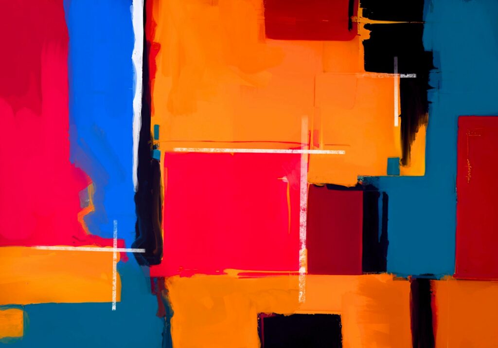
Contrast, on the other hand, is achieved using complementary colors (those opposite on the color wheel) or through variations in value and saturation. Juxtaposing a bright orange with a deep blue, for instance, creates a powerful visual tension that can draw the viewer’s eye and add dynamism to a painting. This interplay is critical in abstract art, where form and subject might be less defined, making color the primary vehicle for expression.
Anya Sharma, mentioned earlier, also uses strategic color contrast. While her landscapes often feature analogous blues and greens, she might introduce a small, highly saturated complementary accent—perhaps a fiery red or a vibrant yellow—to draw attention to a focal point, creating a subtle but impactful visual anchor. This demonstrates how harmony and contrast can coexist.
Modern Art Color Trends: What’s Hot in 2026?
While the core principles of color theory remain timeless, contemporary art often reflects current trends and societal moods. As of May 2026, we’re seeing a fascinating blend of bold, expressive palettes and a return to more grounded, natural tones. Digital art, in particular, allows for an explosion of hyper-saturated, luminous colors that were once difficult or impossible to achieve traditionally.
There’s a notable trend towards using color to express individuality and cultural identity. Artists are increasingly incorporating palettes that reflect their heritage or personal experiences. This can range from the earthy, rich tones found in some African art to the neon, digital-native palettes popular in cyberpunk-inspired digital art.
From a different angle, the conversation around sustainable art practices is also influencing color choices, with some artists favoring natural pigments or palettes inspired by nature’s own hues. This doesn’t negate the use of vibrant synthetics but adds a layer of conscious choice to the artist’s palette.
Common Mistakes Artists Make with Color Theory
Despite the foundational nature of color theory, even experienced artists can fall into common traps. One frequent mistake is relying too heavily on personal preference without considering the psychological impact or compositional role of a color. A color might look beautiful to the artist but might not serve the artwork’s overall message.
Another pitfall is the misuse of saturation or value. Over-saturation can sometimes make a piece feel garish or overwhelming, while a lack of value contrast can lead to a flat, uninteresting composition. Many artists struggle to find the right balance, leading to muddy colors or a loss of visual impact.
A third common error is ignoring the context of color. Colors behave differently depending on their neighbors. What looks harmonious in isolation might clash when placed next to another color in the artwork. Understanding these interactions is key. For example, a bright yellow can appear more vibrant next to a dark purple, but might seem dull next to an even brighter orange.
Practical Solutions for Color Challenges
To avoid these pitfalls, artists can implement several practical strategies. Firstly, always consider the intended mood and message of the artwork before selecting a palette. Ask yourself: what emotion do I want to evoke? What story am I telling?
Secondly, experiment rigorously with value and saturation. Use a grayscale conversion to check for value contrast, and test color combinations in small swatches before committing them to the main piece. Digital art tools offer a great advantage here, allowing for easy experimentation without waste.
Thirdly, study the work of artists you admire. Analyze their color choices and try to understand why they work. This is where learning about color symbolism in art and cultural color meanings can also be incredibly insightful. For example, studying how artists like Agnes Martin used subtle, monochromatic palettes to evoke spirituality can offer profound lessons.
using Color Symbolism and Cultural Meanings
Color symbolism adds another rich layer to the role of color theory in modern art. While some color associations are almost universal (like red for danger), many are culturally specific. In Western cultures, white often symbolizes purity and weddings, while in some East Asian cultures, it’s associated with mourning. Understanding these nuances is vital for artists aiming for global communication or for those specifically referencing cultural themes.
Artists like Yaa Gyasi, while primarily a writer, have explored these themes, and visual artists often engage with similar ideas. A contemporary artist might intentionally use a color with dual meanings—perhaps a color that signifies joy in one culture and sorrow in another—to create a complex, multi-layered message within their work. This deliberate ambiguity can spark deeper engagement and interpretation from the viewer.
For artists working with themes of identity or heritage, incorporating specific cultural color palettes can be a powerful way to honor tradition and connect with their audience on a deeper level. This is not about appropriation, but about informed and respectful integration of meaningful hues.
Practical Tips for Applying Color Theory Today
So, how can artists practically apply these principles in their work as of 2026? Start with a clear intention. Before you pick up a brush or open your digital canvas, have a concept or emotion you want to convey. Let that guide your color choices.
Don’t be afraid to experiment. Use digital tools for rapid prototyping of color schemes, or create numerous small color studies for physical paintings. The more you play with colors, the more intuitive your understanding will become.
Study the masters, both historical and contemporary. Analyze how they use color to achieve specific effects. What makes a palette successful? What makes it fail? Look at artists like Mark Rothko, whose large fields of color are legendary for their emotional power, or contemporary artists known for their distinctive color signatures.
Finally, remember that theory is a guide, not a rigid set of rules. The most impactful art often comes from artists who understand the theory so well they know when and how to break it effectively. The goal is to use color to enhance your vision, not to be constrained by it.
Frequently Asked Questions
What is the most important aspect of color theory for modern artists?
The most important aspect is understanding how color impacts emotion and perception. Modern artists use this knowledge to intentionally guide the viewer’s experience and convey specific messages or feelings through their work.
How has color theory evolved in contemporary art?
Color theory in contemporary art has evolved to incorporate digital mediums, global cultural influences, and a greater emphasis on personal expression. While core principles remain, their application is more diverse and experimental than ever before.
Can color theory be applied to black and white art?
While not directly using color, artists working in monochrome can still apply color theory principles through value (lightness/darkness) and contrast. The relationship between different shades of gray can create similar visual dynamics to those achieved with color.
What are complementary colors and why are they important?
Complementary colors are opposite each other on the color wheel (e.g., red and green). They create high contrast when placed next to each other, making both colors appear more vibrant and drawing attention, which artists use for dynamic compositions.
How do I choose a color palette for my artwork?
Start with your artwork’s intention or emotion. Use color schemes like analogous (harmonious) or complementary (contrasting) as a starting point, and experiment with different hues, saturations, and values until you achieve the desired visual impact.
Are there specific color trends artists should follow in 2026?
While trends shift, as of May 2026, there’s a blend of bold digital-native palettes and a return to natural, earthy tones. Artists are also increasingly using color to express individuality and cultural identity rather than strictly adhering to trending palettes.
The role of color theory in modern art is far from static. It’s a dynamic, evolving field that empowers artists to communicate on a deeper level. By understanding and thoughtfully applying its principles, artists can imbue their work with greater emotional resonance, visual appeal, and intentionality.
Actionable Takeaway: This week, choose one artwork you’re currently creating or planning. Identify the primary emotion or message you want to convey, and then select your color palette with that intention firmly in mind, consciously using principles of harmony and contrast.
Last reviewed: May 2026. Information current as of publication; pricing and product details may change.
Source: Britannica
Related Articles
- Prizmatem vs. Traditional Tools: Why Switch in 2026
- From Collaboration to Consolidation: The Tech Partnership
- Uncuymaza: A UK Guide to Its Potential
Editorial Note: This article was researched and written by the Afro Literary Magazine editorial team. We fact-check our content and update it regularly. For questions or corrections, contact us. Knowing how to address The Role of Color Theory in Modern Art early makes the rest of your plan easier to keep on track.